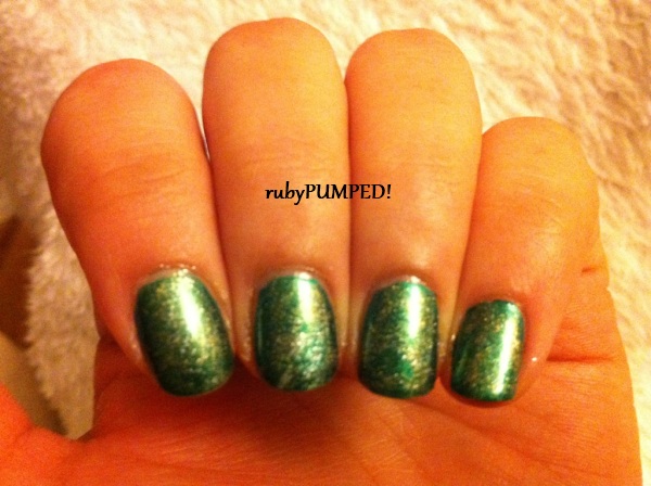
Let's see, I got Snowglobe and Hallucinate each on sale. After lemming Pearl Harbor for literally years, I finally snagged it, and I was just gifted Opal Glitter as an extra in a swap. They're all similar, so here is my first comparison post evar!!!!
2 coats of each. As you can tell, Snow Globe definitely has the fattest pieces, but they're still fairly small (closer to glitter than confetti). Hallucinate has a rough texture and is my favorite in this picture, but in real life it ties with Pearl Harbor, which I call Final Fantasy IX in my head. I call it that because, 1. Pearl Harbor has negative connotations when phrased alone, and 2. The subtle blue sheen it casts reminds me of the game. (It's my third-favorite game, btw.) The sheen is more visible in
this post. At 2 coats, Opal Glitter looks exactly like Hallucinate with less density, but at 4 coats it is a perfect blend of Hallucinate and Pearl Harbor.
Whew! 1st comparison mani down! What do you think?